Switch 开关
此组件在界面上显示一个开关.
| 键 | 类型 | 描述 | 必选 | 默认值 | 最低版本需求 |
|---|---|---|---|---|---|
| negate | 布尔型 | 反转开关显示情况 | - | false |
- |
| trueValue | 基本类型 | 当结果为 true 时保存的值若不填则保存 true |
- | true |
- |
| falseValue | 基本类型 | 当结果为 false 时保存的值若不填则保存 false |
- | false |
- |
| 返回类型 | 描述 |
|---|---|
| 基本类型 | 与开关状态一致, 但若 negate 为真, 配置值为开关状态取反.若存在, 配置值会被 trueValue 或 falseValue 代替. |
主题
| 主题键 | 类型 | 描述 |
|---|---|---|
| offTintColor | 颜色 | 关闭时开关底色 |
| onTintColor | 颜色 | 开启时开关底色 |
| thumbTintColor | 颜色 | 开关中心色 |
示例
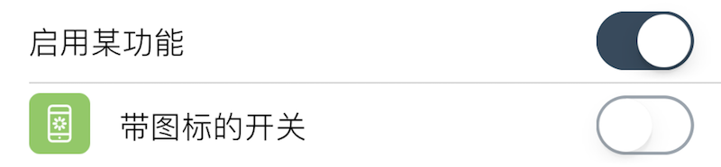
{
    default = true;
    label = "启用某功能";
    cell = "Switch";
    key = "enabled";  -- 该项存储的键,读取该键配置时需要用到
};
{
    default = false;
    label = "带图标的开关";
    cell = "Switch";
    key = "enabled1";  -- 该项存储的键,读取该键配置时需要用到
    icon = "res/16.png";  -- 其它有些组件也可以设置图标
    readonly = true;  -- 所有组件都支持禁用
};